Overview
Jivada is an Indian Ayurvedic wellness brand selling organic skincare, haircare, and body products online. I was brought in as the sole designer to design the complete e-commerce experience from scratch — no existing design system, no prior UX work, just a client brief, a brand identity, and six weeks.
The brief was clear: build a trustworthy, easy-to-navigate online store that converts first-time visitors into buyers. The Ayurvedic wellness space is competitive — dominated by established brands like Forest Essentials and Kama Ayurveda — and Jivada needed a digital presence that could hold its own without their marketing budgets.
I owned every phase: research, information architecture, visual design, component documentation, and developer handoff. The product launched as a live website at jivada.in.
Research
With a 6-week timeline and no research budget, I ran two parallel workstreams: a quantitative survey to understand the target audience's online shopping behaviour, and a structured competitor analysis to map the existing market landscape and identify where Jivada could differentiate.
Survey — 36 responses
I designed and distributed a Google Forms survey titled "Research for E-commerce Platform" targeting cosmetics and skincare buyers. 36 responses gave enough signal to make confident design decisions on key questions.
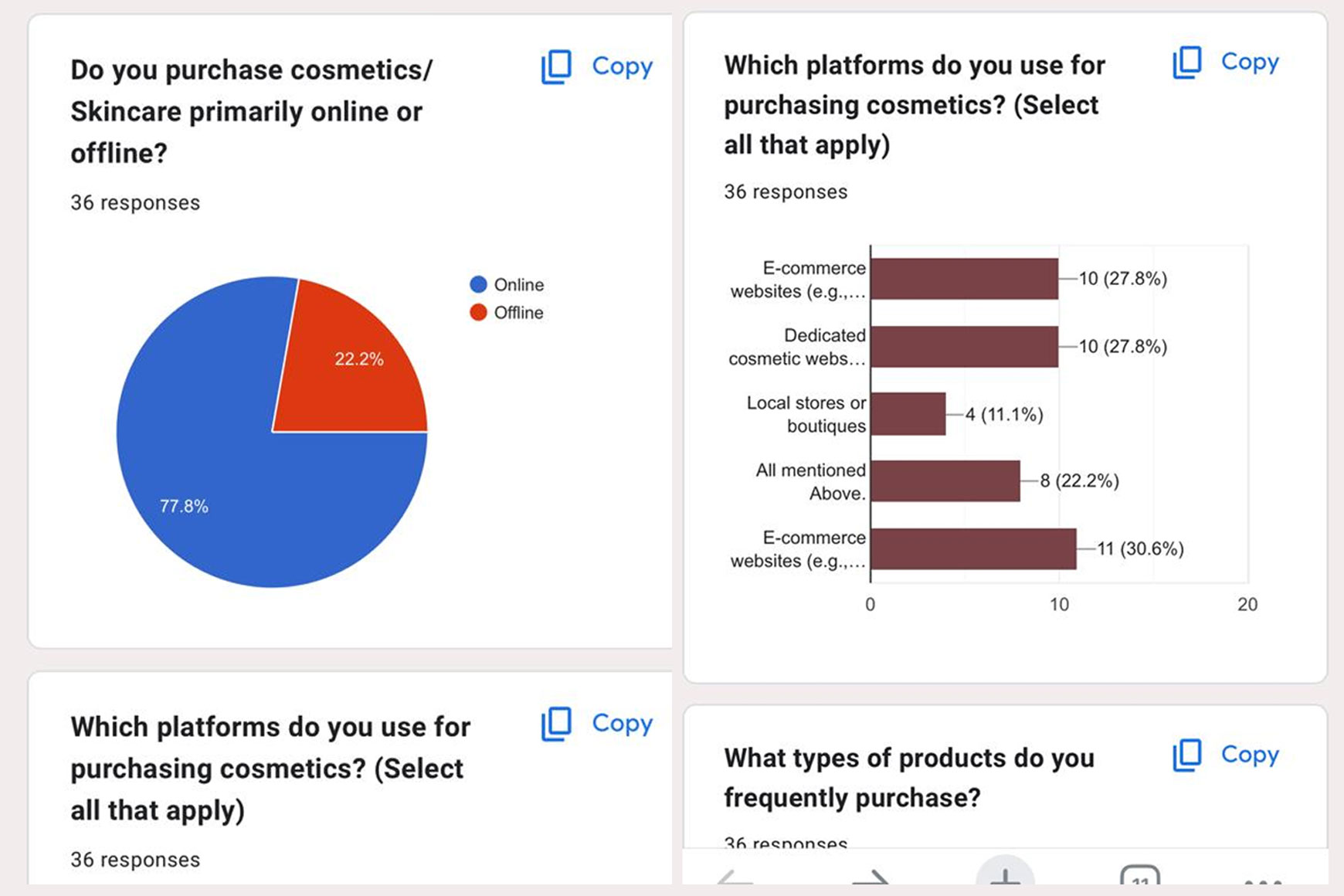
Do you purchase cosmetics/skincare primarily online or offline?
36 responses
How often do you order cosmetics online?
36 responses
Which platforms do you use for purchasing cosmetics?
36 responses — select all that apply
What the survey told me
77.8% primarily shop online. The challenge isn't convincing users to buy online — it's convincing them to buy from Jivada specifically.
63.9% buy occasionally — not impulsively. Users take time before purchasing. Trust and product information matter more than urgency tactics.
27.8% use dedicated cosmetic websites. A brand-owned store can compete — but only if it projects the same credibility as established platforms.
Competitor analysis — Peepal Tree & Sadhev
I analysed two direct competitors in the Indian Ayurvedic organic space, mapping each against three dimensions: unique value proposition, advantages to learn from, and disadvantages that were design opportunities for Jivada.
Competitor analysis in FigJam — UVP, advantages and disadvantages mapped for Peepal Tree and Sadhev
| Competitor | What they do well | Where they fall short | Opportunity for Jivada |
|---|---|---|---|
| Peepal Tree | Strong Cultural storytelling, geographic sections, product origin credits | Weak Footer description too heavy, product cards need improvement, pricing hierarchy unclear | Clear pricing, lighter information density, better card hierarchy |
| Sadhev | Strong Cruelty-free credentials, traditional Kerala craftsmanship, organic USP clear | Weak Product card too large, shop page dense, brand story and hero could be merged, font hierarchy weak, payment options dated | Cleaner card design, merged brand narrative into hero, modern payment UX |
Information architecture
Before any screen design, I mapped the complete site structure in Figma — every page, every section within each page, and the content components that would populate them. This IA diagram served as the contract between me and the client on scope, and as the blueprint the developer would use to build the CMS structure.
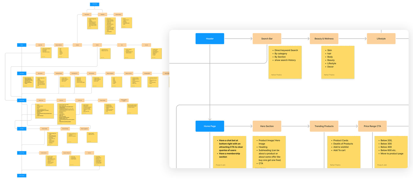
Full IA — sitemap (left) covering all pages and states; component-level detail (right) for each major section including Header, Home Page, and product flows
Key IA decisions
Sadhev and Peepal Tree both organised by branded sub-ranges. I reorganised Jivada's nav by product function — Skin Care, Body Care, Hair Care, Wellness, Health Care — because survey data showed occasional buyers approach by need, not brand familiarity.
63.9% of surveyed buyers purchase occasionally — they're considered, not impulsive. I added a skin quiz ("Not sure what to buy?") as a homepage section to guide undecided users to relevant products without requiring them to know the category system.
Competitor analysis showed Sadhev's checkout felt like leaving the site. I designed Jivada's checkout as a slide-in modal with a persistent cart sidebar — keeping the user in context and reducing the psychological commitment of "going to checkout."
Free shipping threshold, online support, flexible payment, organic certification, and secure payments were placed structurally — in the footer strip, on product pages, and in the checkout flow — not as a single trust-badge panel that users learn to ignore.
Design decisions
Every screen was designed to answer a specific problem identified in research or competitive analysis. Below are the key decisions at each stage of the purchase funnel, with the reasoning behind them.
A full-funnel homepage — from discovery to conviction
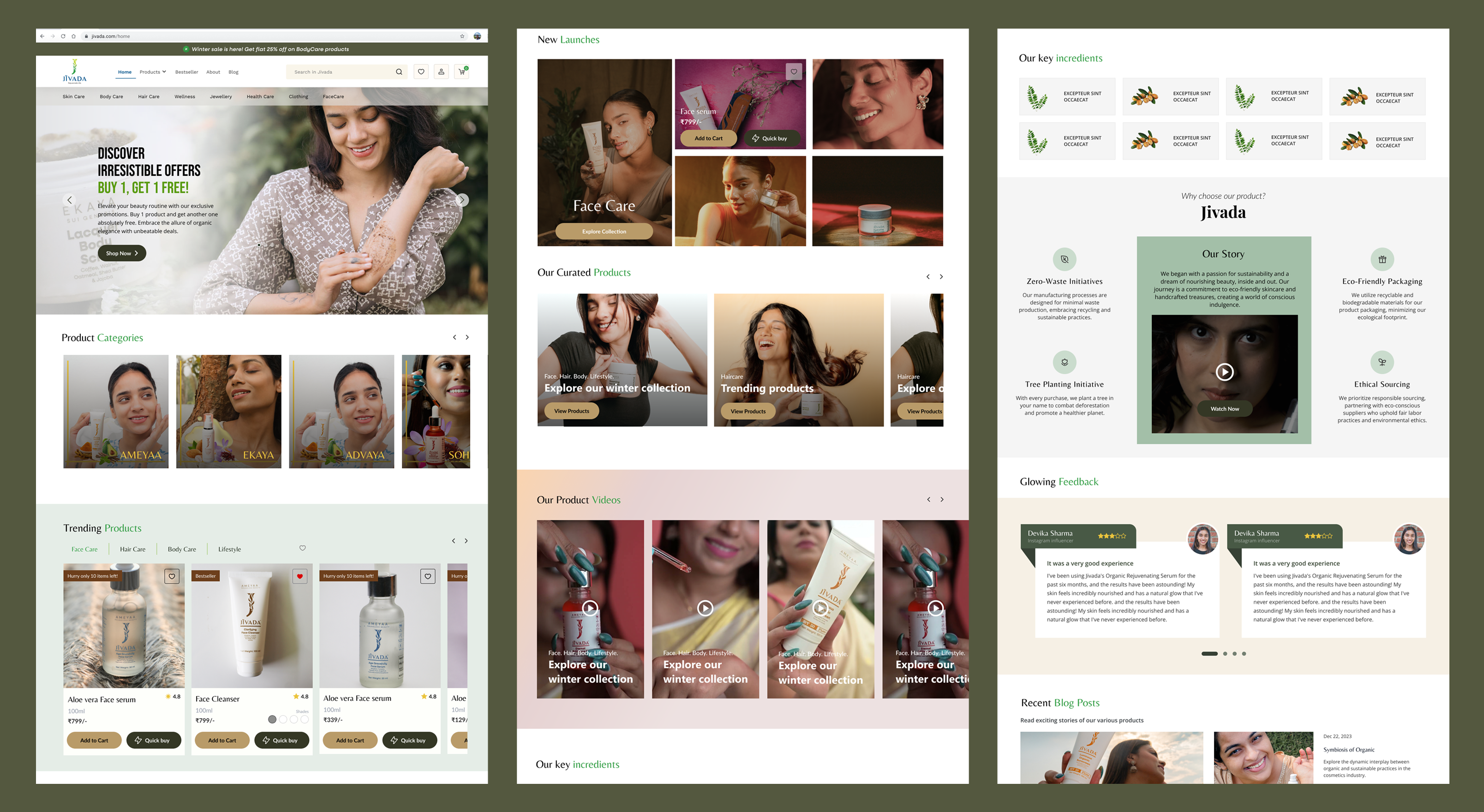
The homepage needed to do more work than a typical e-commerce site because Jivada had no brand recognition. I designed a content hierarchy that moved users from awareness (hero + offer) → browsing (trending + categories) → consideration (brand story + ingredients + skin quiz) → social proof (reviews + blog) → purchase (clear CTAs throughout). Each section had a distinct job.

Homepage (guest user) — hero offer banner, product categories with icons, trending products, new launches, daily care collection, brand story, skin quiz, key ingredients, customer reviews, blog posts, FAQ, and comprehensive footer
Information-rich product pages that earn the purchase decision
The biggest design challenge on product pages was information density. Ayurvedic buyers want to know ingredients, sourcing, skin type suitability, and how to use the product — but they don't want to read a wall of text. I designed a structured information hierarchy: size variants and price immediately visible, directions to apply as a visual 3-step process, product description with a supporting video, specs in a scannable table, full ingredients list below the fold.

Product detail page — size variant selector, 4.8★ rating (790 reviews), visual directions to apply, ingredients, customer reviews, cross-category discovery section
A full-page checkout with persistent order summary
The desktop checkout used a 2-column layout: order summary with coupon code on the left, 3-step form on the right. The order summary stays visible throughout — users can see exactly what they're paying for while filling in address and payment details. Coupon codes were handled inline with immediate visual feedback (code applied, discount shown). Payment options included UPI, Visa, Mastercard, and RuPay — the full Indian digital payments landscape.

Desktop checkout — 2-column layout with persistent order summary, coupon applied state, contact → shipping → payment flow, "Pay Now" with security reassurance footer
A 3-step modal flow that keeps users in context
The mobile checkout was the most considered design decision in the project. Rather than redirecting to a full checkout page (which competitor analysis showed felt jarring), I designed a slide-in modal with a clear 3-step progress indicator at the top: Mobile → Address → Pay. The order summary was collapsible — visible when needed, tucked away when filling in forms. Each step had a single primary action: "Continue."


3-step checkout modal: Step 1 (Mobile number + order summary collapsed/expanded) · Step 2 (Saved address, free shipping confirmed, earliest delivery date) · Step 3 (UPI with QR, cards, netbanking, wallets, COD — all with 2% prepaid discount)


Order summary expanded (item names, individual prices, MRP total, discount, subtotal, free shipping, final total) · Address edit form (pincode auto-fills city/state, address type: Home/Work)
Every Indian payment method, clearly organised
The payment step was designed around one insight: Indian digital payments are fragmented. A user might prefer UPI, their parent might prefer netbanking, a gift buyer might use a credit card. I included all five methods — UPI (with live QR + UPI ID field), Debit/Credit Cards, Netbanking, Wallets, and Cash on Delivery — each with a clear icon, price, and a "Get 2% discount" incentive for prepaid options. COD showed the full price without the discount, creating a natural nudge without being manipulative.
Component system
All screens were built from a shared Figma component library. The component sheet shown below documents the Header variants, Product Card states, Quick View modal, and Order History/Cart cards — covering every state a real user would encounter across the purchase flow.

Figma component library — Header (2 variants: logged-out / logged-in), Product Card (6 states), Quick View modal (in-stock / out-of-stock), Order History Card, Wishlist Card, Cart Card, Browse variants
Key component decisions
Logged-out shows Log In + Register. Logged-in shows user icon, wishlist, and cart badge. Built as separate Figma components — no hidden layers, no toggle states — so implementation was unambiguous.
Default · colour swatches · add to wishlist · scarcity badge · wishlisted (red heart) · in-cart (quantity stepper replaces CTA). Every state designed before any screen used the component.
"Only 10 items left!" uses a dark/black badge. Red tested as alarming — at odds with the calm, trustworthy tone the brand needed. Urgency without anxiety.
The quick view out-of-stock state keeps the shade/size selector visible. Users are more likely to find an available variant than leave the product if given the option.
Visual foundation — colour tokens (forest green primary, earthy neutrals), typography pairing (serif display + DM Sans body), spacing scale, and button system
What I learned
- Survey data, even at 36 responses, makes decisions defensible. "77.8% buy online" isn't a groundbreaking insight — but it's the difference between a design decision that feels like a guess and one the client trusts. Small-scale research is underrated.
- Competitor analysis is faster and more actionable than it looks. Two hours mapping Peepal Tree and Sadhev gave me a clear list of what to copy, what to avoid, and where the market gap was. It's not glamorous research, but it's highly efficient for a solo designer with a short timeline.
- The checkout modal was the right call — and also the hardest to defend. The client initially wanted a standard checkout page. I had to argue for the modal approach using competitor screenshots and the survey's "occasional buyer" insight. Winning that argument was a skill exercise as much as a design one.
- Component-first design at the start saves time at the end. Because I built the product card states in Figma before composing any product listing pages, every screen that used the card was consistent. The developer asked zero questions about card behaviour during implementation.
- Information hierarchy on product pages is the conversion lever, not visual design. Ayurvedic buyers are sceptical. They read. Putting ingredients, sourcing, and directions to apply prominently — not buried below the fold — was more important than any visual treatment.
Reflection
Jivada was the project that showed me what solo ownership actually means. There's no UX researcher to hand research to, no visual designer to hand wireframes to, no one to catch the things you miss. Every decision — from the IA structure to the scarcity badge colour — was mine to make and mine to defend.
The constraint that shaped the whole project was the "occasional buyer" finding from the survey. 63.9% of users buy cosmetics occasionally, not habitually. That single data point reframed everything: the homepage content strategy, the product page information density, the skin quiz, the checkout modal design. When you know your user is considered rather than impulsive, you design for trust first and speed second.
If I were doing this project again with more time, I'd add at least 3 rounds of lightweight user testing — showing the checkout modal to 5 people before building it would have caught the address edit flow issues we patched after launch. But within the constraints that existed, this is work I'd stand behind in any interview room.