AVAILABLE FOR FREELANCE & FULL-TIME ROLES
© 2026
Let's talk

Enterprise Product Design · Healthcare SaaS · Design Systems & Cross-Functional Ownership

Designing operational clarity for 5 hospitals

How I owned the end-to-end design of a role-based enterprise dashboard — from on-site research through a scalable Figma design system to developer handoff — translating a deeply technical, fragmented operation into something a tired night-shift technician could trust in seconds, while cutting maintenance response time by 65%.
Role
Lead Product Designer · Design System Owner
Context
Healthcare SaaS · 5 hospitals
Duration
6 months
Team
1 PM · 3 Engineers · 1 Data Analyst
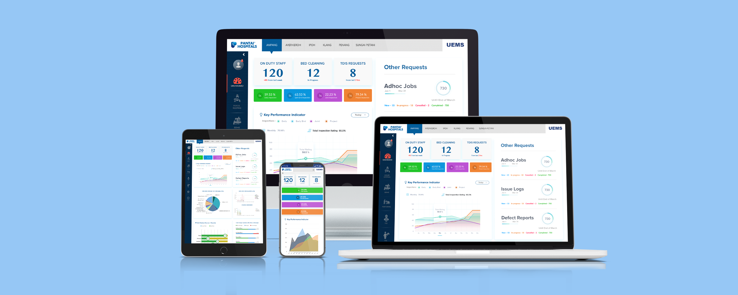
Pantai Hospitals role-based dashboard shown across desktop, tablet and mobile
65%
Faster maintenance response
4.5hrs → 1.6hrs
£1.8M
Estimated annual
operational savings
78%
Increase in technician
productivity
92%
Preventive maintenance
compliance rate
61%
Reduction in manual
reporting time

Translating a technically complex, fragmented operation into one coherent system

Pantai Hospitals is one of Malaysia's largest private hospital groups, operating 5 major facilities with hundreds of facility management staff across housekeeping, maintenance, and operations teams. When I joined this engagement, the entire operations layer ran on paper work orders, radio calls, and disconnected spreadsheets — and the cost was measurable.

I was brought in as Lead Product Designer to take ownership of the design process end-to-end: design a role-based enterprise dashboard from the ground up, build the design system underneath it, and work closely with the 3-person engineering team to ship it inside real technical constraints — HVAC integrations, hospital network security, and legacy data sources none of us could redesign away.

The hardest part wasn't visual design. It was understanding genuinely complex operational and technical systems well enough to make them feel simple to someone with thirty seconds and no patience for a learning curve.

"In healthcare operations, a 46-minute delay in room turnover isn't just an efficiency problem — it directly affects patient care. The design had to earn trust from day one and be learnable in a single shift."

Systemic failures, deeply normalised — and far more costly than anyone had realised

Before any design work began, I spent two weeks embedded alongside operations teams across two hospital sites. The problems were compounding across every layer of the operation.

📋
61%
of manager time spent compiling reports from disconnected systems
📻
43+
radio calls per supervisor shift — no task visibility, no audit trail
🚶
3+ mi
walked per technician daily to collect paper work orders
⏱️
4.5 hrs
average maintenance response through 3+ manual handoffs
📊
4 hrs old
data driving live resource and shift planning decisions
🧾
3 days
to compile compliance reports from paper records

Six weeks of non-negotiable research across five parallel workstreams

With six months to deliver a production platform, I front-loaded research heavily. The complexity meant assumptions made early would compound into expensive mistakes later.

01

35 contextual interviews across all three user roles and all 5 sites

Each participant walked me through their last full shift — every tool used, every friction point, every workaround normalised. Consistent failure patterns emerged within the first week across 8 shift patterns.

02

80+ hours of on-site workflow observation across all shift types

Shadowing supervisors, technicians, and facility managers through live shifts exposed improvised workarounds staff had built into daily routines that no one had documented.

03

6 months of historical work order data analysed with the data analyst

Mapped response time patterns, bottleneck locations, and failure clusters — converting anecdotal frustrations into quantified problems that became the dashboard's KPIs.

04

18 KPIs identified and prioritised with PM and operations director

Facilitated a prioritisation session to sequence which KPIs needed to surface at launch versus phase two — preventing scope overload.

05

Technical discovery session with the development team

Covered HVAC integration, safety data compliance, real-time notification architecture, and mobile-first requirements — before any wireframes began.

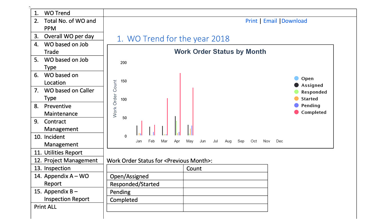
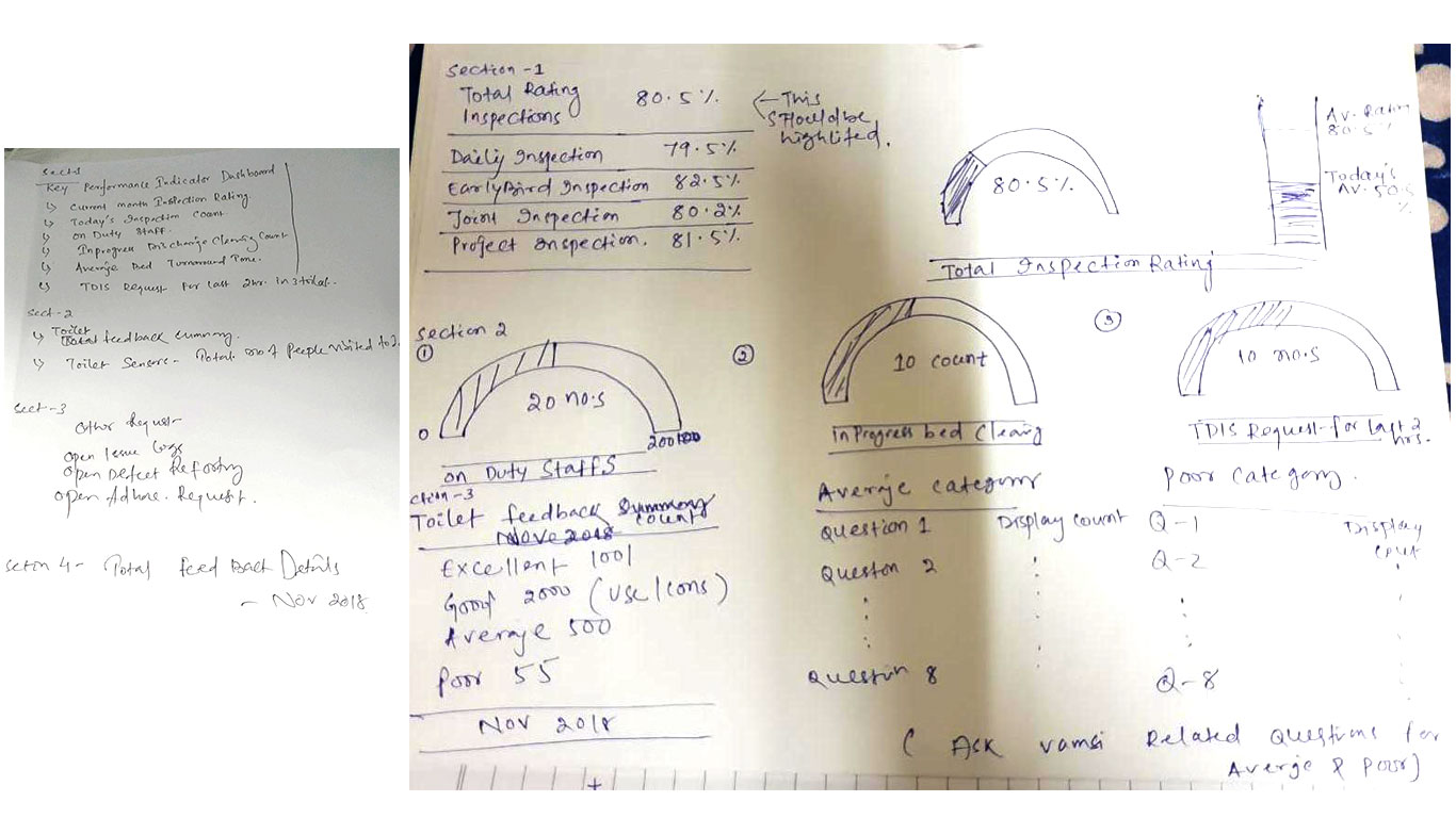
Hand-drawn early sketches mapping the KPI dashboard structure and inspection rating displays

Early ideation — mapping which KPIs needed top-level visibility before a single pixel was designed in Figma. These sketches came directly out of the technical discovery session with engineering.

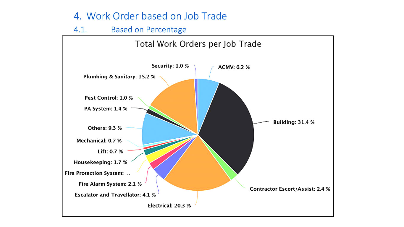
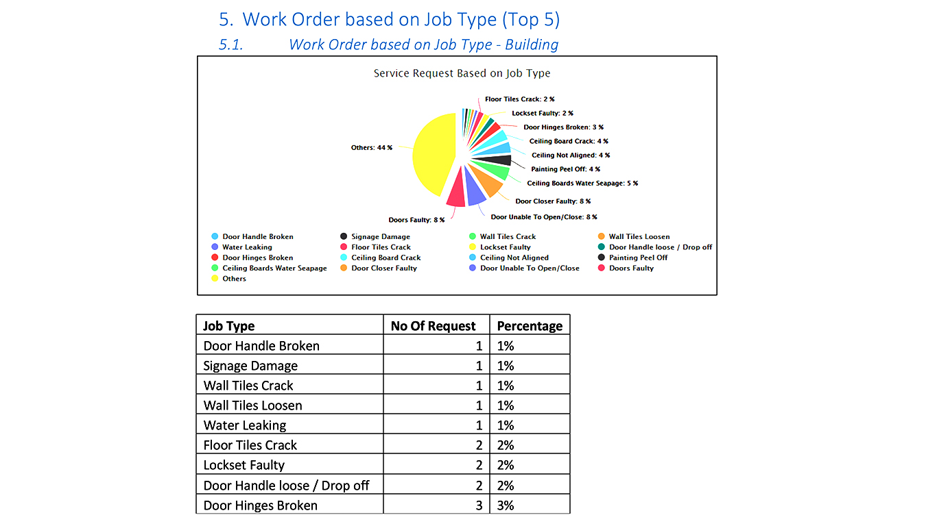
Low-fidelity wireframe of the facility manager dashboard layout Low-fidelity wireframe exploring KPI card hierarchy Low-fidelity wireframe of the mobile technician job flow

Early low-fidelity wireframes — tested with real hospital staff before any visual design work began, so structural problems surfaced while they were still cheap to fix.

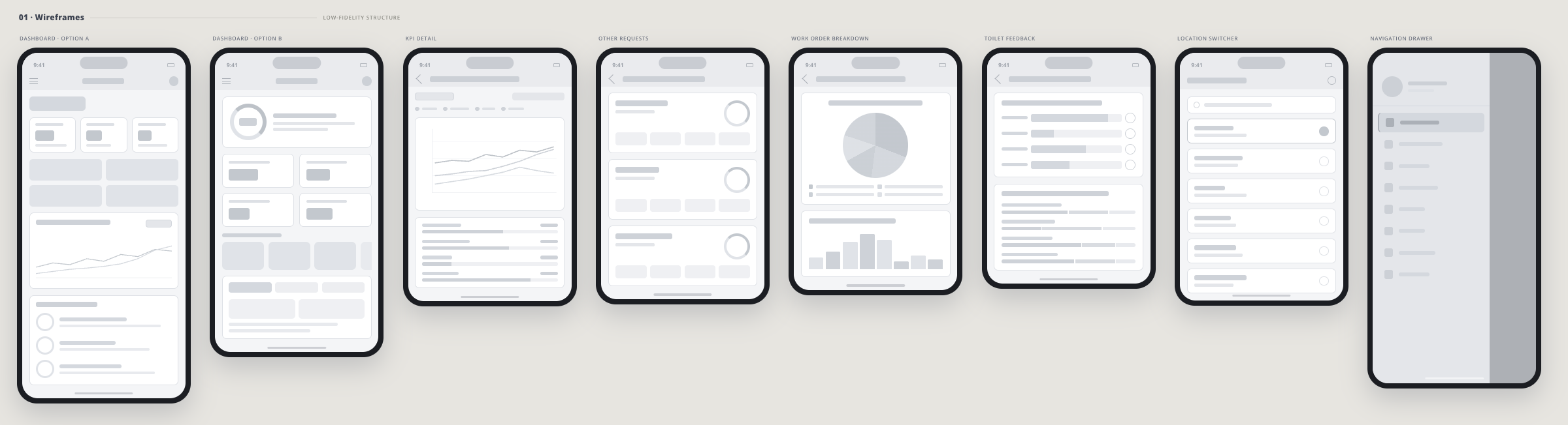
01 · Wireframes Low-fidelity structure — 8 screens
Dashboard · Option ADashboard · Option B KPI DetailOther Requests Work Order BreakdownToilet Feedback Location SwitcherNavigation Drawer
All 8 Pantai UEMS mobile wireframes — low-fidelity structure showing Dashboard Option A, Dashboard Option B, KPI Detail, Other Requests, Work Order Breakdown, Toilet Feedback, Location Switcher, and Navigation Drawer

8 wireframe screens — tested with real hospital staff across 3 rounds before any high-fidelity design began. Each screen maps directly to a role-specific workflow identified in research.

Key insights

Insight 01

Role context shapes everything

A single dashboard serving all three user types would have failed each of them. Every role needed fundamentally different information density and primary actions.

Insight 02

Mobile is the primary surface, not secondary

89% of operational tasks happened away from a desk. For technicians and supervisors, mobile was the entire experience.

Insight 03

Shift handoffs were the single biggest failure point

The design needed to make handoff communication structural and documented — not dependent on memory or verbal briefings.

Insight 04

Healthcare staff distrust unfamiliar systems

The UI had to feel immediately intuitive — learnable in a single shift — or adoption would fail regardless of technical capability.

Three distinct users — one unified design system, three purpose-built views

FM
Desk-based · Oversees all 5 sites · 15+ yrs experience
Facility Manager
  • No live view — all data hours out of date
  • Manual report compilation consumed the working day
  • Needed real-time visibility across sites
  • Accountable for compliance with no audit trail to point to
HS
Mobile & floor-based · 15–25 staff per shift · 8 yrs experience
Housekeeping Supervisor
  • 43+ radio calls per shift — no digital audit trail
  • Paper-based task assignment, no completion tracking
  • No supply or inventory visibility in the field
  • Shift handoffs relied entirely on verbal memory
MT
Fully mobile · Field operations · 12 yrs experience
Maintenance Technician
  • Physical work order collection — 3+ miles of daily travel
  • No priority indication on incoming jobs
  • Radio-dependent, no real-time status updates
  • No way to document completed work on-site

Every decision traceable to a research finding

The guiding principle across all decisions: reduce cognitive load in a high-stakes environment. Healthcare workers can't afford to interpret an interface — the right action has to be obvious.

Decision 01 · IA

Three purpose-built views, one unified design system

The temptation in enterprise design is to build one configurable system that serves everyone. The research made clear this would fail. I designed three distinct views — each optimised for its user's tasks and decision context — sharing a single Figma component library with consistent tokens and patterns.

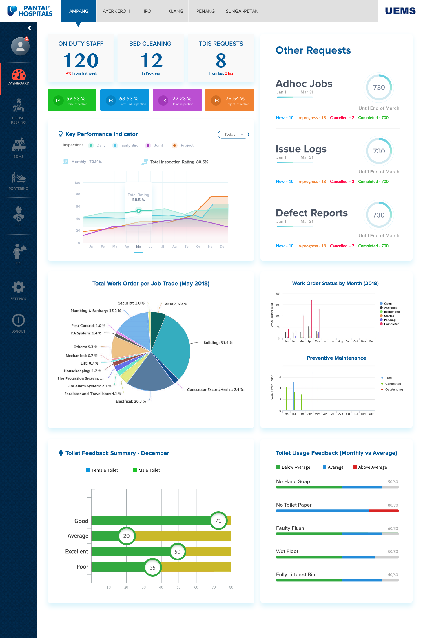
Facility Manager dashboard — KPI command centre with inspection ratings, work order breakdowns and toilet feedback summaries

Facility Manager view — built from the shared component library: KPI tiles, status pills, and chart components reused across all three role-based dashboards.

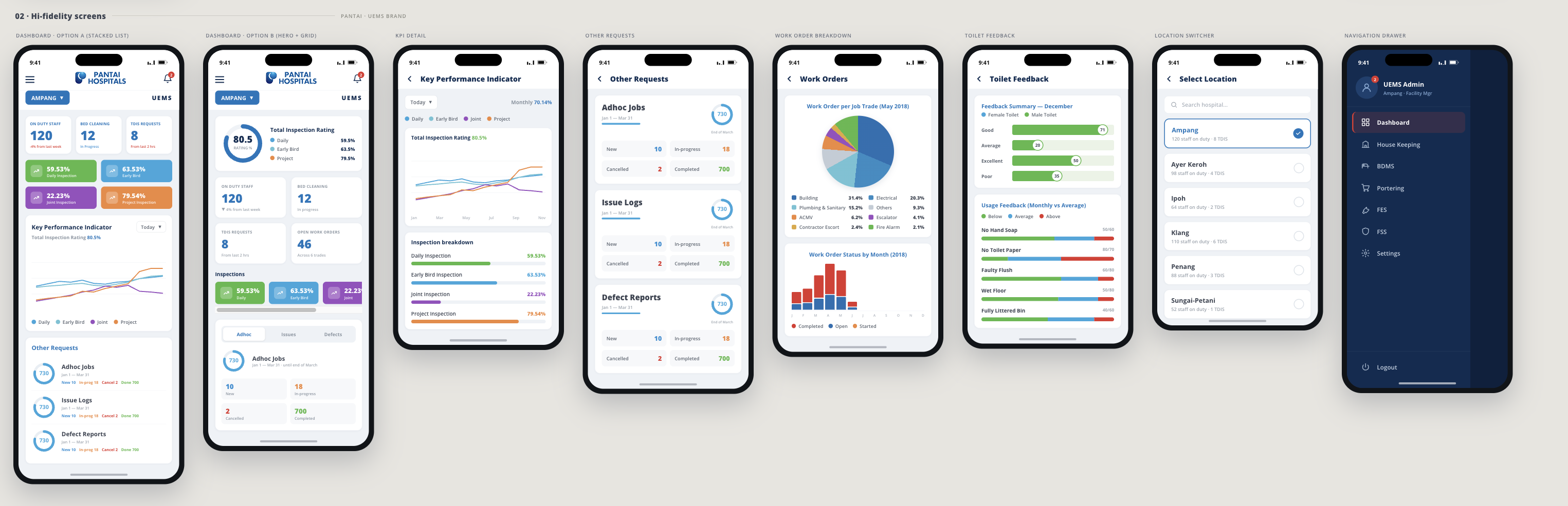
02 · Hi-fidelity Screens Pantai UEMS Brand — 8 screens
Dashboard · Option ADashboard · Option B KPI DetailOther Requests Work Order BreakdownToilet Feedback Location SwitcherNavigation Drawer
All 8 Pantai UEMS hi-fidelity mobile screens — Dashboard stacked list, Dashboard hero grid, KPI Performance Indicator, Other Requests, Work Order Breakdown, Toilet Feedback, Location Switcher, Navigation Drawer

Final hi-fidelity screens applying the Pantai UEMS brand system — each screen directly evolved from its wireframe counterpart, validated across three usability testing rounds before engineering handoff.

Decision 02 · Hierarchy

Progressive disclosure to eliminate cognitive overload

Each surface showed only what the user needed to act right now. Critical issues were elevated with a red-priority system — visually impossible to miss and semantically impossible to confuse with routine tasks. This was the most-cited improvement in post-launch feedback.

Decision 03 · Mobile

Replaced paper work orders with a mobile-native job flow

Jobs appeared as a prioritised list with urgency indicators, one-tap acknowledgement, and inline documentation. Tap targets were set to 48px minimum. This single change drove the 65% reduction in response time.

Wireframe of the mobile technician job flow with prioritised list and one-tap acknowledgement

Mobile job flow wireframe — refined across three rounds of usability testing before development began.

Decision 04 · Handoff

Made shift handoffs structural, documented, and non-negotiable

Outgoing supervisors formally logged outstanding tasks before signing off. The incoming supervisor received a structured written summary with one-tap acknowledgement — a timestamped audit record replacing the verbal briefing.

Decision 05 · Compliance

Turned 3-day manual reporting into a single export action

I mapped exactly which data points each compliance report required, then designed the platform to capture those points passively — a byproduct of normal use, not a separate logging task.

Building a reusable component library, not just three screens

Shipping three role-based views without a shared system would have meant three sets of inconsistent patterns and a maintenance burden for engineering. So before high-fidelity design began, I built a token-based Figma design system that every view — and every future feature — would be built from.

System · Tokens

A token-based component library shared across all three views

Colour tokens (including dedicated priority/urgency states), a 4px spacing scale, type styles, and 30+ reusable components — KPI tiles, status pills, chart containers, mobile nav patterns — documented in a single Figma library so design changes propagated everywhere at once instead of being patched screen by screen.

Testing · Iteration

Three structured rounds of usability testing, not one validation pass

Early concept testing caught the one-dashboard failure before any high-fidelity work started. A mid-fidelity prototype round validated the priority system and mobile job flow. A pre-launch round with the production build caught smaller friction points — tap target sizing, label clarity — before go-live.

Handoff · Engineering

Weekly syncs with the 3-engineer team and Figma Dev Mode handoff

Specs, redlines, and accessibility annotations (contrast ratios, tap target sizes, screen-reader labels) were maintained directly in Figma. A shared technical-constraints document — covering HVAC integration limits, hospital network security, and offline behaviour — was updated jointly with engineering throughout the build, not handed over once at the end.

Retro · Roadmap

A 90-day retrospective against the 18 KPIs defined in research

Post-launch metrics were checked against the original research baselines, not vanity numbers invented after the fact. The retrospective fed two prioritised iterations directly into the phase-two roadmap.

Three directions tested, found to be wrong, and replaced

Failed attempt — abandoned after first usability test

One dashboard for all three roles

My initial proposal was a single platform with role-based toggles. The first usability test with 6 real hospital staff broke the assumption completely — none of the three roles shared a workflow or decision context. I redesigned into three purpose-built views with a shared component library.

Failed attempt — required full rearchitecture

External push notification architecture

The original alert system relied on external push services. Technical discovery confirmed hospital Wi-Fi across 3 of the 5 sites blocked external push for security compliance. We pivoted to a polling-based in-app system with a sub-60-second refresh cycle. The 65% response time reduction held regardless.

Descoped — removed from phase 1 after technical scoping

Automated technician job routing algorithm

The original brief included GPS-based auto-routing. After scoping the backend requirements — continuous polling, skill taxonomy, battery drain — we agreed it was 6–8 weeks that would delay launch. We removed it and shipped a supervised manual dispatch flow instead.

Tracked over 90 days post-launch

65%
Reduction in maintenance response time (4.5hrs → 1.6hrs) — driven by the mobile-native technician job flow replacing the multi-handoff radio process.
£1.8M
Estimated annual operational cost savings — from reduced overtime, faster room turnover, and eliminated manual reporting labour across all 5 sites.
78%
Increase in technician productivity — mobile access, priority indicators, and inline documentation removed friction from every step.
92%
Preventive maintenance compliance rate — up from a baseline estimated below 60%, by making compliance the path of least resistance.
61%
Reduction in manager manual reporting time — live KPIs replaced hours of spreadsheet compilation.
Zero
Shift handoff errors — outstanding tasks are now logged structurally and acknowledged digitally, eliminating the verbal-briefing failure point identified in research.
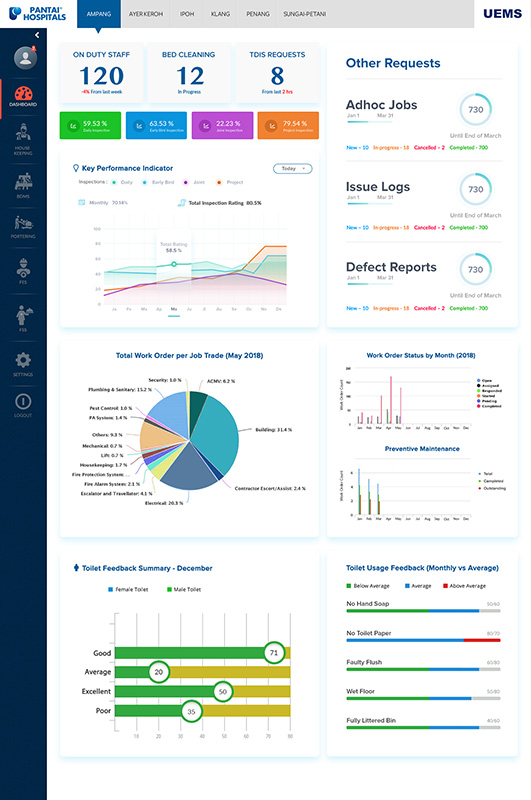
Detailed view of the final Pantai Hospitals dashboard with KPI tiles, work order trend charts and toilet feedback metrics

Final shipped dashboard — every component traced back to the design system's shared token library.

Figma Figma Dev Mode Illustrator Adobe XD Photoshop Hotjar Google Analytics UserTesting Miro Jira Slack

What this project taught me about enterprise product design

01

Observational research surfaces what interviews miss

The 80+ hours on-site produced the most valuable inputs — particularly around shift handoff failures no one would describe as problems in an interview.

02

A shared design system makes role-specificity affordable

Three purpose-built views only stayed maintainable because they were built from one token-based component library — role-specificity beat universal flexibility without multiplying engineering effort.

03

In healthcare, cognitive load reduction is a safety issue

Designing for low mental effort wasn't a UX preference — it was a clinical requirement. Ambiguity in a high-pressure environment creates errors.

04

Compliance by design, not by enforcement

The 92% compliance rate came from making compliance the easiest path, not from training harder.

05

Quantify the problem before you design the solution

Six months of operational data meant every priority was backed by a number and every post-launch metric had a clear baseline.

06

Constraints discovered early are solved problems

The push notification failure would have been a launch blocker at handoff. Discovery before wireframes made it solvable instead.

What enterprise product design actually requires

Pantai Hospitals is the project I point to when asked what it takes to own a design process end-to-end on a deeply technical, high-stakes system. It wasn't about making things look clean — it was about understanding HVAC integration limits, safety-compliance requirements, and three conflicting workflows well enough to redesign how the operation actually worked, then build a design system robust enough to scale across all of it.

The most valuable skill I exercised wasn't visual craft — it was translating real operational and technical complexity into something a tired night-shift technician could trust in seconds. Taking something genuinely complex underneath and making the surface simple is the part of product design I find most interesting, regardless of the domain it shows up in next.

I also learned what cross-functional design ownership looks like in practice: weekly syncs with engineering to understand what was technically feasible, usability testing structured enough to kill my own first idea when the data said so, and a component library disciplined enough that three very different interfaces still felt like one product.

← Previous · Jivada — Ayurvedic E-commerce All projects → View full portfolio