Design System · Enterprise Product Design · Healthcare SaaS
Color, type, components and patterns powering the Pantai Hospitals operations dashboard across mobile and desktop — built for clarity in high-stakes hospital environments where speed of comprehension is a clinical requirement.
Why a shared system was non-negotiable
Context
Three role-based dashboards — Facility Manager, Housekeeping Supervisor, Maintenance Technician — sharing no components would have meant three times the design effort, three times the engineering ambiguity, and three inconsistent products that felt like different tools rather than one coherent platform.
Building a shared design system before high-fidelity design began was the decision that made the rest of the project possible: role-specificity at zero extra cost to consistency, and a component library that engineering could build against with confidence from day one.
"A status pill that handles 'New / In-Progress / Cancelled / Completed' needs different visual weight from a KPI ring showing an inspection percentage. The system only works if the designer understands the domain."
What I built
Shipping three role-based views without a shared system would have meant three sets of inconsistent patterns and a maintenance burden for engineering. So before high-fidelity design began, I built a token-based Figma design system that every view — and every future feature — would be built from.
Brand Blue (#1668E3), Navy (#0E1F4D), and Teal (#15B5A6) form the core palette, extended with inspection-category colours (Daily, Early Bird, Joint, Project) that carry semantic meaning throughout every dashboard surface — status pills, KPI rings, chart lines, and alert states all reference the same token layer.
The type system prioritises legibility at small sizes and high information density. Tabular numerals for all data display — KPI tiles, inspection ratings, job counts — so numbers never shift width when values change. Five levels: Display, Section, Card, Body, Eyebrow.
Every component uses multiples of 4px for all spacing. Four radius steps (ctrl, input, card, pill) and three elevation levels (flat, card, float) keep the product feeling unified even as component complexity scales up.
Primary, Secondary, Ghost, Danger, Small, Large, Disabled — each documented with a use case rule, not just a visual spec. Location Selector, Segmented Tabs, Toggles, and Notification components designed for the data-dense hospital ops context.
The most system-specific layer — built for the exact data types the platform surfaces. Every component variant maps to a real operational data type identified during the 35-interview research phase.
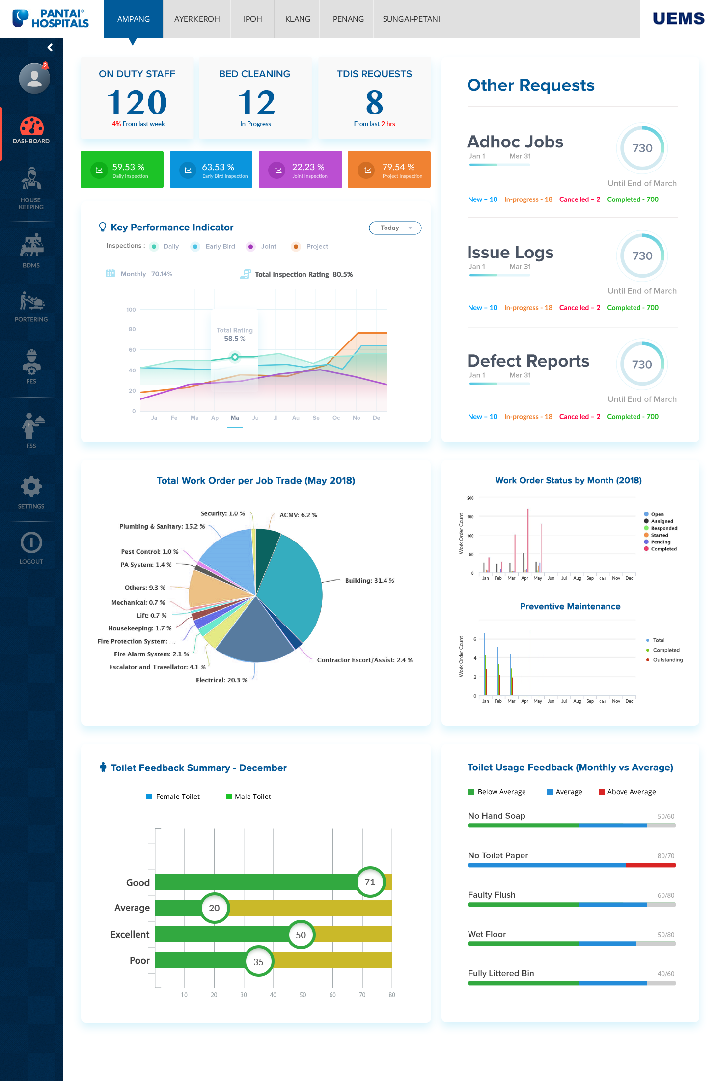
Pie (work order by trade), Grouped Bar (work order status by month), and Multi-line (total inspection rating trend) — each built from the token layer so colours, weights, and label styles stay consistent with the rest of the product.
The app shell includes a dark-mode navigation drawer (UEMS Admin with role, hospital list, module links, logout) and a location switcher modal for switching between 5+ hospital sites.
Calm, precise, operational. Lead with the number, label it plainly, never decorate clinical data.
The same tokens and components above, assembled into the Facility Manager dashboard that actually shipped to Pantai's nine hospital sites.
Reflection
A design system for an enterprise healthcare product isn't a sticker sheet — it only works if the designer understands the domain deeply enough to know which data types need which visual treatment. A status pill that handles "New / In-Progress / Cancelled / Completed" needs different visual weight from a KPI ring showing a daily inspection percentage. Getting that mapping right meant I had to understand the operational reality of hospital facility management before I could design a single token.
The decision to put tabular numerals everywhere came directly from 80+ hours of on-site observation: facility managers scan dashboards while walking between wards, glancing for seconds at a time. Numbers that shift width as they update — even by a pixel — break that scanning rhythm. That's a typography decision that originates entirely from watching real people use the product under real time pressure, not from a style guide.
Documentation had to assume zero context. With a three-person engineering team handling implementation and no dedicated design-systems engineer, every component spec needed to answer "when do I use this" as clearly as "what does this look like" — otherwise the system would drift the moment a new screen needed a judgment call I wasn't in the room for.